
Dangerous Heights
Dangerous Heights
Dangerous Heights
Anton Palmer
Aspiring Game- & UI designer
Song of the Bardbarians HUD & Menus
For our second school project - Song of the Bardbarians - , I wanted to focus on the UI of the game.
UI and menu art created by https://www.artstation.com/ciccu.

I continuously worked along artists to create the HUD as well as the menus for the game. Since I am a terrible artist, I mainly focused on creating representations that an actual artist then could visualize properly.
Win screen representation made by me

Final Win screen made by an artist

HUD-Design
Because you play as a bardbarian (a mix of a barbarian and a very metal-inspired bard), I wanted to implement these two themes into the HUD to make it thematically coherent to the gameplay.
To know what I needed for the HUD, I started by making a breakdown of what the player needs to know at all times and what thereby always should be visible on screen while playing.
HUD-wise, these were the three elements that I considered were necessary for the player to always be able to see:
1. The player's health-bar
2. The Action Points bar (a typical stamina bar; actions cost Action points to do)
3. A Power bar: Whenever you play the guitar in the game, this bar is filled up. When you stop playing, you will gain a power-up, which becomes stronger the more you managed to fill of the power bar.
Finally, when you play on the guitar in the game, icons start falling down that you need to press within the correct timewindow, in a 'Guitar Hero'-like style. This quickly made me consider the HUD to be a guitar of some sort, so the 'notes' would fall downwards towards the guitar, giving the impression that you are strumming the guitar.
First HUD-iteration made by me

In the first iteration of the HUD, I wanted to have a Shield as the health bar, to symbol the player's defensive part, and since the character's weapon is a guitar axe, I wanted the two remaining bars to be the two necks of a two-headed guitar.
First HUD-iteration made by an artist

However, I didn't like that your resources were so separated over the screen (where health was in one corner and the other two bars in another), as that would divert the player from looking at the center of the screen for a slighlty longer period of time. So to find a solution to this, I decided to try to ccombine the Guitar with the health globe, so the player could quicky glance down to one corner of the screen, get the information they needed and then return to looking at their character.
Therefore, I tried a couple of different designs of how to combine the two without making it become too much information centered at one point and still easily readable quickly.
Iterations of guitar & implementation of Health bar into the guitar

I started by redrawing of the HUD made by an artist to try to use the same type of shapes and colors. However, I realised that a rounder shape was easier to read for health than the shape in this image above, and I didn't want to use more bars as there already were two on the guitar. Therefor, the next iteration of the guitar turned out like this:

The shape of the guitar is a lot better here and the health it also easier to read than the previous image. At this point though, I got the feedback that is was odd that the HUD was a double-headed guitar and the player uses a single-headed, and recommended me to do a single-headed instead to make it more feel like it was the player' guitar.
I didn't mind this, as an issue with this iteration was that it had a lot of empty space on its body that didn't serve any purpose, more than disrupting the player's view. So to solve this, I tried combining the two necks of the guitar into one thicker neck.

The two necks were combined and it was apparent that it wouldn't be difficult to read the two even though they were so close to each other, thanks to their colors. Now all the necessary information was there in an easily readable fashion. Now all that was left was to reshape the guitar to obstruct the player's view as little as possible, while still giving all the important information.

I tried a couple of different shapes from references and ended up with this one. Here I could the rounder shape of the body of the guitar to place the health-globe within without making it stick out oddly shape wise.

Final iteration of the guitar made by me: the health globe is a lot bigger than before and the guitar is slightly shorter to give as much information as possible while also obstructing the view as little as possible. Of course, also keeping it easily readable; the health globe could have been closer to the bars and the guitar could have been shorter, but I chose to leave it like this to not make it cluttered to read.
Final Iteration of HUD, made by artists
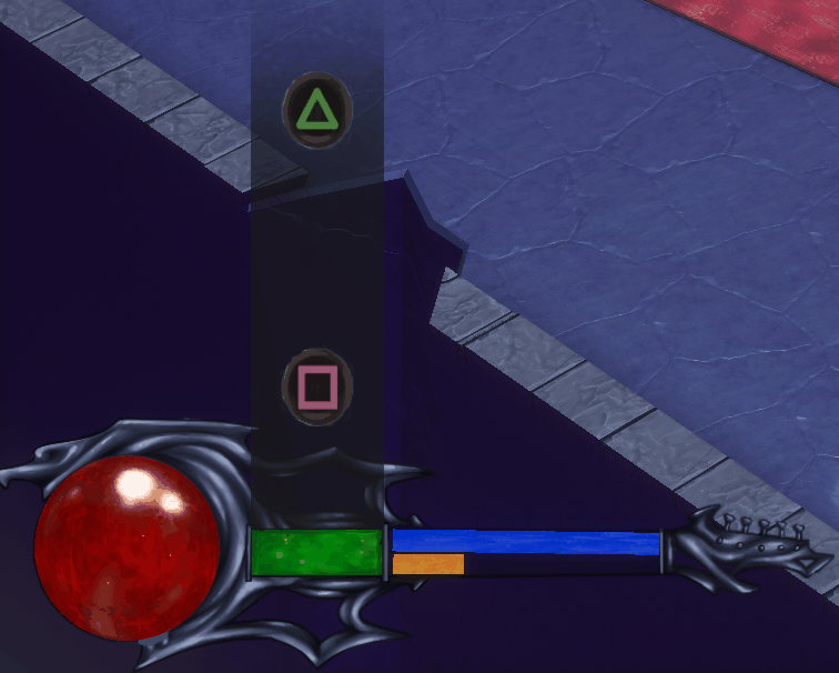
This is the final version of the HUD that we used in the game. The artist made some of the edges sharper and added holes in the guitar to make it look better.
The bar to where the notes fall was also increased, as we realised that it needed to me more visible than we initially thought.
Menu Design
Start Menu
Design

Game version

We didn't have any time to create a cutscene to tell the story of the game (that your band members have been kidnapped and that you need to save them), and we didn't want to to tell the story with text either, as it would feel out of place. Instead, we decided that the start menu and the win screen instead both would act as storytellers. In the start menu, we can see that the orcs are dragging away one of your band members, and that you can't save her because of the goblins, telling of hinting to the player that you need to go save her.


Since the game builds a lot on humour (with the orcs and goblins in the evil 'ORChestra') The bardbarians VS goblins is also a reference to the famous doom (2016) poster art.
Instructions menu
Design

Game version

For menus that are activated and then takes up the entire screen, I didn't want to create new unique art, as that would both take a lot of time and still not be all too visible. Instead, We reused the scene view that already is open (either the starting menu scene like here, or the game scene) and uses that as background. Of course, to make it a lot easier to read, all buttons and text from the background menu have been removed to only keep the image.
To not make it difficult to read with so much in the background, there is a comletely black screen that the opacity has been lowered on between the background and the menu. This makes the background lose a lot of value and contrast, and thereby doesn't catch the eye as easily but rather stays as a background object.
Ingame menu
Design

Game version

The pause menu is the player's guitar that appears over the screen, and to go between the different options, you move your plectrum up or down.
As with the instructions menu, this one also dims down the game in background to make it apparent that it isn't the focus right now.
Credits menu
Game version

The credits menu doesn't have a design image to follow. It came up quite late in the project that we wanted a credits menu, so the artist that created the art and I discussed it together and came up with creatingg a notestand with notes and to have the names curved after the shape of the paper.
Win screen
Design

Game version

As with the start screen, this one should tell a story about what happens, as the game end with the player moving towards the cage with its band members within. Afterwards we see this, telling us that they got out and are wreaking havoc.
Back